What is Peek Pro?
Peek Pro is a reservation and business management platform for tour operators. It has a wide range of functionality, including an online booking flow, point of sale systems, CRM tools, activity / rental calendars, and more.
A Fun Challenge
This project revolved around systems thinking. It wasn’t just about redesigning a single booking flow; it was about redesigning an existing system of booking flows that could accommodate a wide range of use cases across our 4,000+ tour businesses. My designs needed to support these existing use cases while expanding functionality in key areas. The designs also had to be flexible, working well with various content and striking a balance between customizability and design guardrails that would ensure usability and high conversion rates.
My Role
As the most experienced Senior Product Designer at Peek, I spearheaded this redesign project, collaborating closely three other Designers, a UX Researcher, the Director of Design, a Product Manager, several Developers, and other stakeholders.
Tour Customers

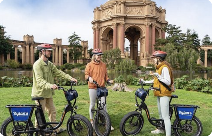
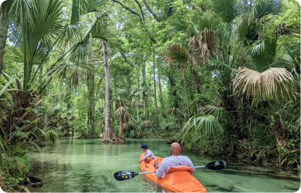
Millions of customers use Peek's booking flow each year to book experiences.
☞ Adults of all ages and levels of computer literacy.
☞ Mostly in the US, but some international customers.
Tour customers' top needs:
☞ Find an experience that works for their date, time, and price range.
☞ Learn about the experience (what to bring, safety, cancellation, etc.)
☞ Complete their booking.
Tour Operators

Tour operators are not the users of the booking flow – they're the ones configuring it. They run the day-to-day operations of their tour and/or rental business, and have titles like Business Owner and Location Manager.
Tour operators' top needs:
☞ Maximize bookings and upsells (such as add-ons, tips, and bundles).
☞ Customize the booking flow for my business.
☞ Present my business as professional and trustworthy.
👆 Increase Conversion
Our primary goal was to increase the booking conversion rate. The booking flow is the main source of revenue for Peek's tour operators, so increasing the conversion rate just a few percent would translate to millions in additional revenue!
🎯 Target New Verticals
We had hundreds of feature requests about the booking flow. My redesign would need to focus on the features that aligned with our product strategy, and supported the needs of new tour verticals we wanted to unlock.
✨ Enhance Operators' Brands
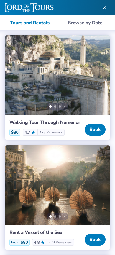
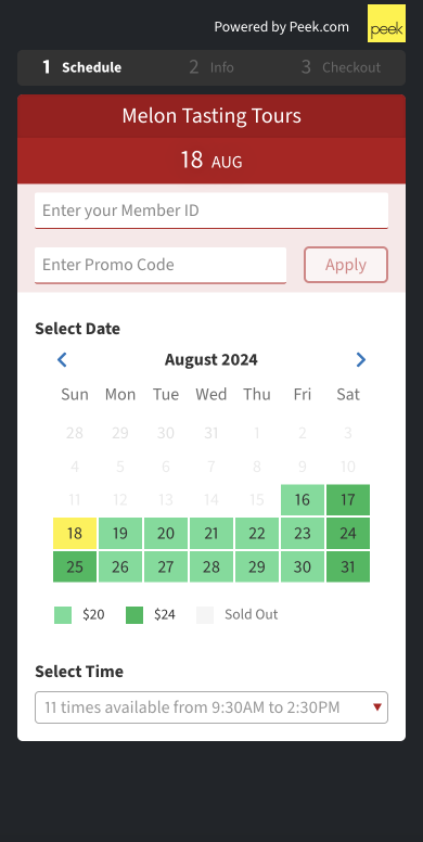
Many tour operators had complained that the booking flow looked outdated (see screenshots below). Our goal was to modernize the interface and allowing some customization that would allow operators to match their branding.
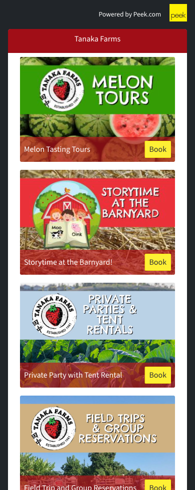
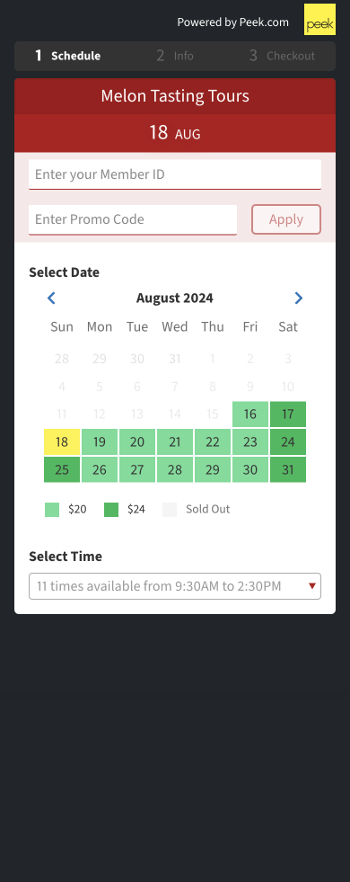
Understanding the Existing Flow
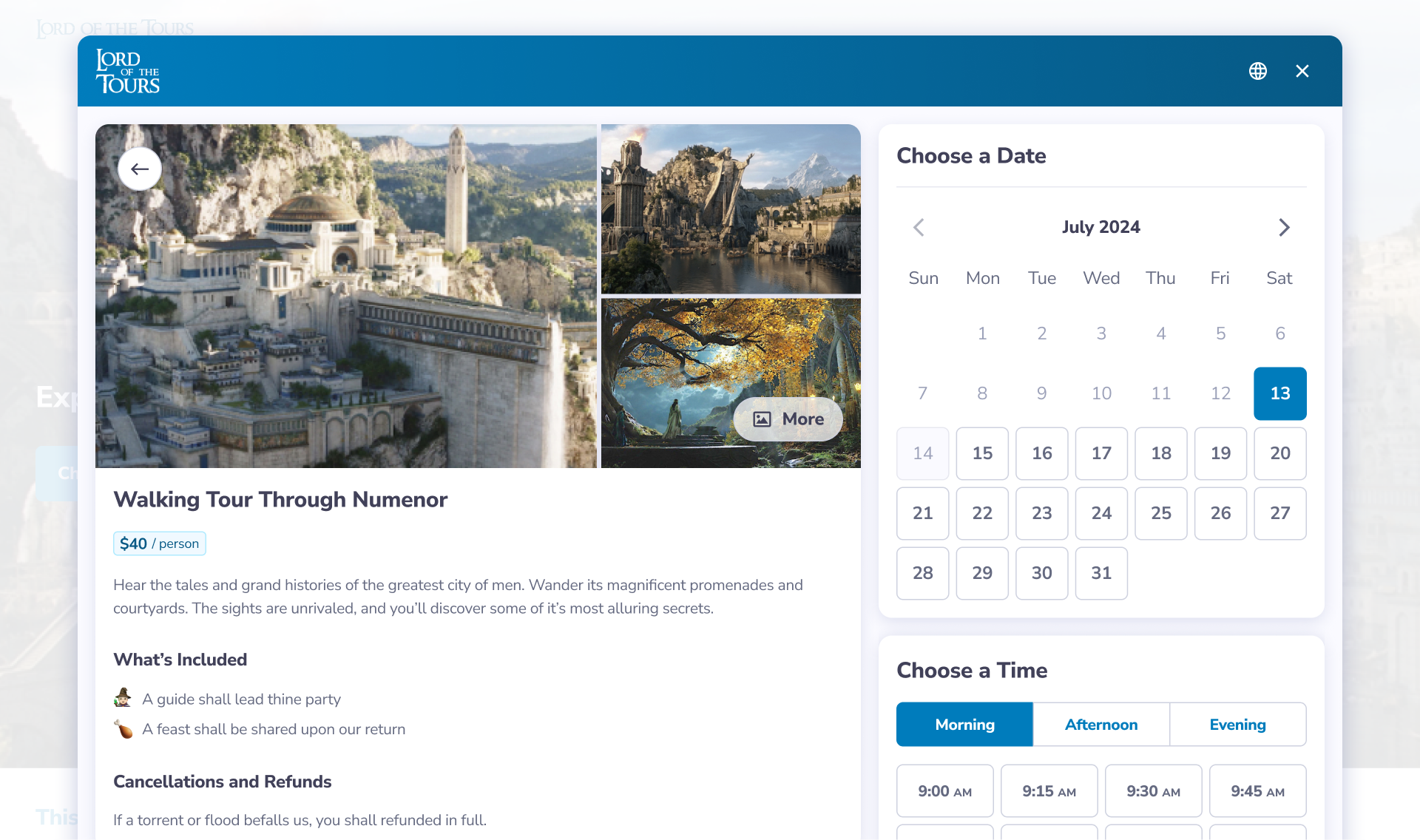
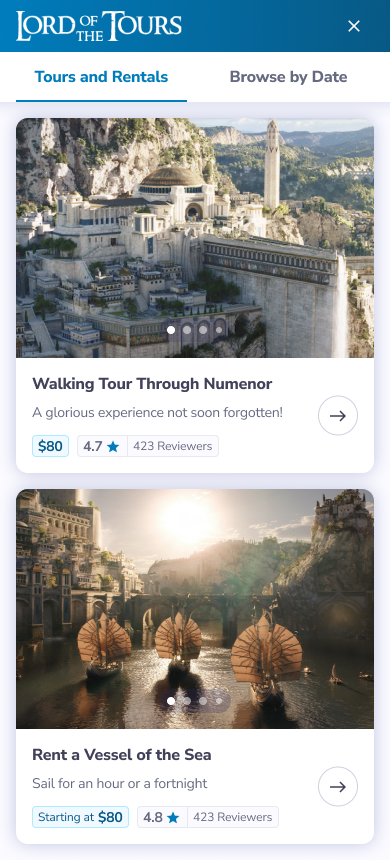
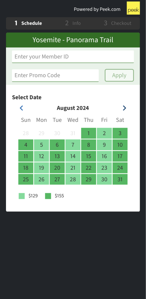
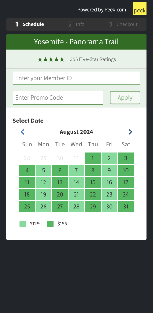
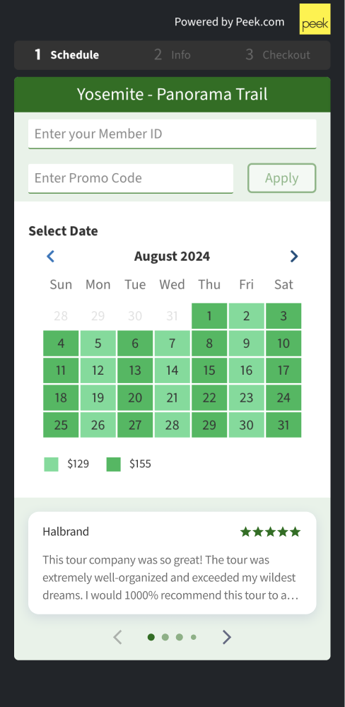
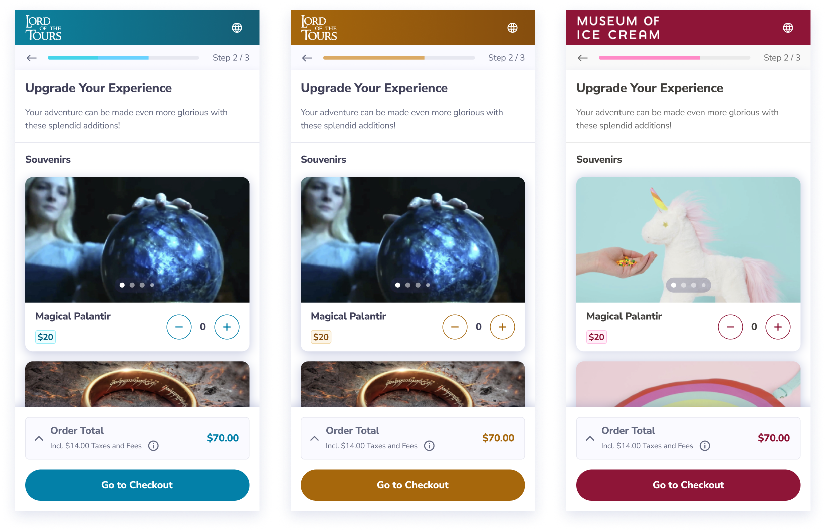
How it works: a "Book Now" button installed on the tour operator's website opens Peek's booking flow, where users can browse tour / rental options and book. Operators can choose from various color themes to better reflect their brand.
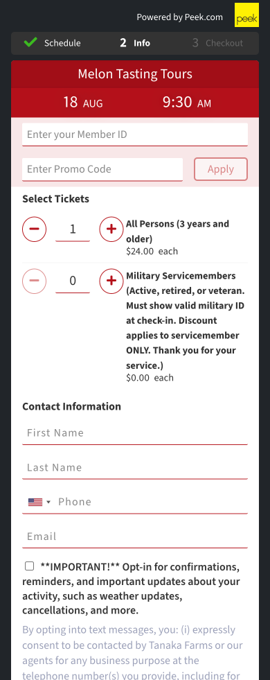
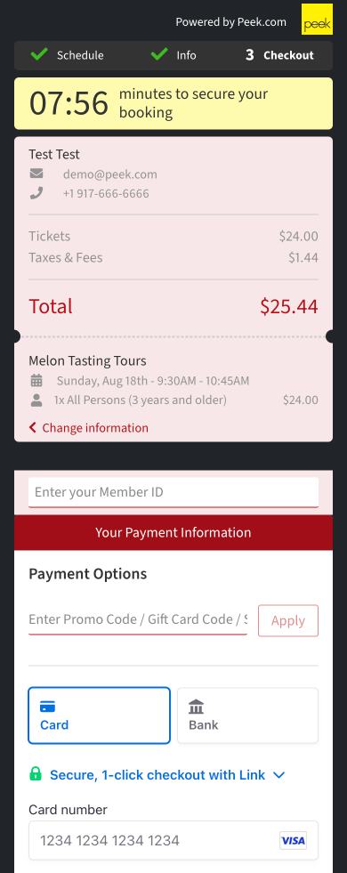
Here are the main steps of the mobile booking flow, as customized by a farm tour:
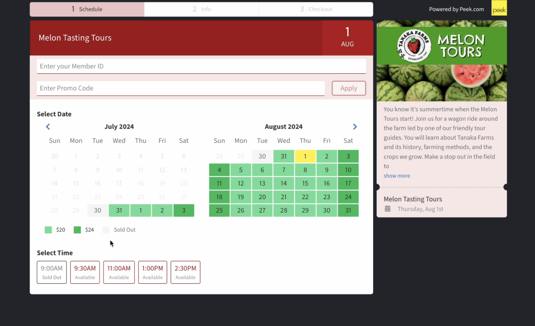
Here's the first step (after selecting a tour) on desktop:
The existing flow had dozens of variations, which allowed tour operators to:
☞ sell rentals (vs. activities)
☞ sell add-on items / tour bundles
☞ leverage dynamic pricing (different prices on different dates / times)
☞ allow alternative payment methods like PayPal
☞ and dozens more configuration options
To complicate matters, thousands of tour operators already relied on this flow to collecting bookings. My new booking flow needed to elegantly handle the existing configurations and facilitate an easy transition for existing operators.
Feature Requests
Peek supports a wide range of verticals (from zip lining, to ATV rentals, to immersive museums) which meant a wide range of feature requests about the booking flow – there were hundreds. To figure out which requests were the most critical, we looked at the total revenue across all customers tagged on each request.
Competitive Analysis
I reviewed dozens of booking flows on both mobile and desktop. Here's a glance at some of the more instructive booking flows:
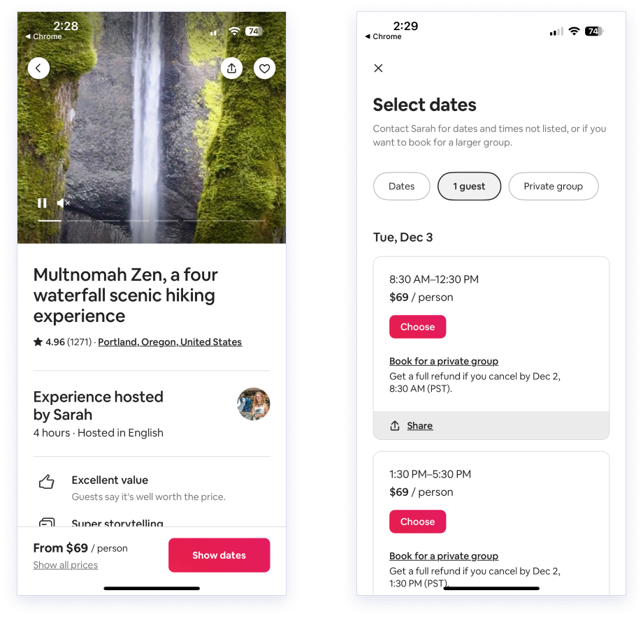
Airbnb Experiences
Fever
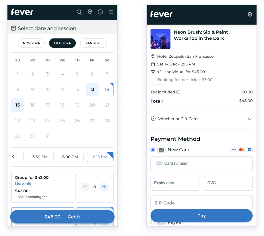
TickX
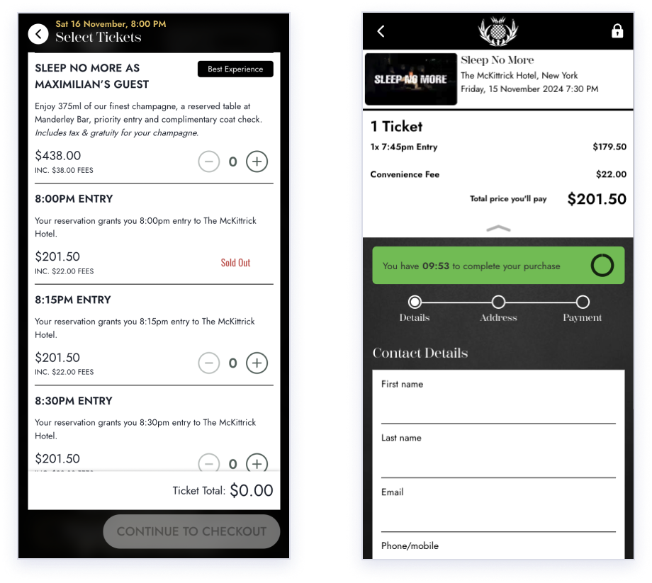
Tiqets
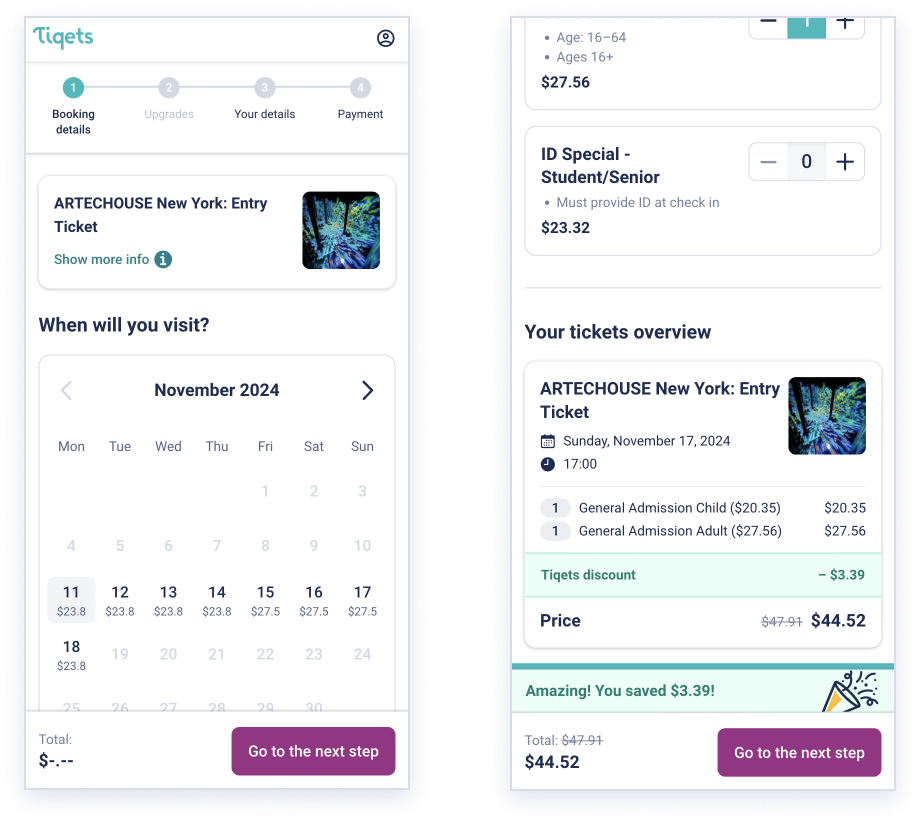
Key takeaways from the competitive analysis:
Prominent visuals: multiple large photos and / or videos helps sell the experience.
Social proof: showing ratings and reviews ("⭐️ 4.96") is a common tactic to increase conversion rates, because users look to social proof as a shortcut to decide if an experience seems fun and trustworthy.
Creating urgency: elements like a countdown timer, or a popup with "24 people are eyeing these dates", nudge you to book now (or you might miss out!)
Multiple steps: Most booking flows use 2 - 4 steps. This keeps the user focused on the current step. Including a stepper or progress bar can also increase users' motivation to complete the flow by harnessing the goal-gradient effect.
Product Analytics
I worked with our PM to see what we could learn from Mixpanel and PostHog.
Key Insights from analytics tools:
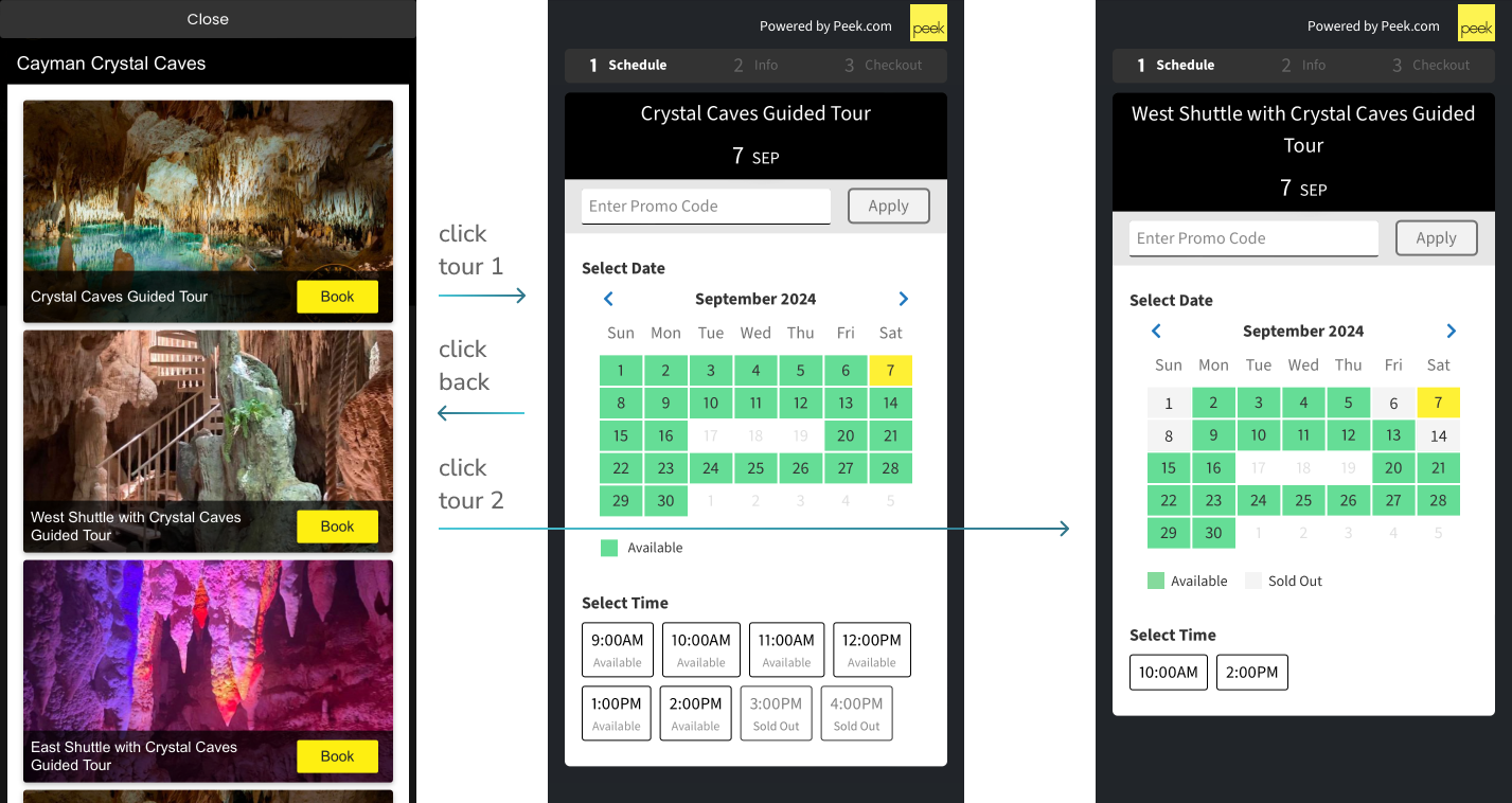
☞ Users were clicking back and forth between tours to compare availability. Enabling them to view the availability of multiple tours at once could be a huge time-saver.
☞ Users were hovering over the Promo Code input, then bouncing. They were Googling for a promo code! Showing a Promo Code input on this step was not just distracting, it was lowering conversion by making users think "how can I save money?" rather than "how awesome does the tour look!"
☞ Users were clicking on disabled buttons (such as they grey "Sold Out" times).
☞ Users were missing the tap target of small buttons.
Brainstormin' with Stakeholders
I used FigJam to run brainstorming sessions with Design, Support, Sales, and PMs. These teams had spent a lot of time talking with our customers, so they had great input about which features might have the biggest impact.
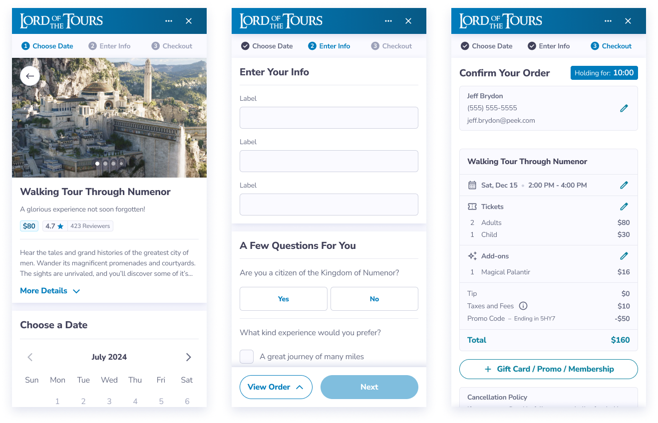
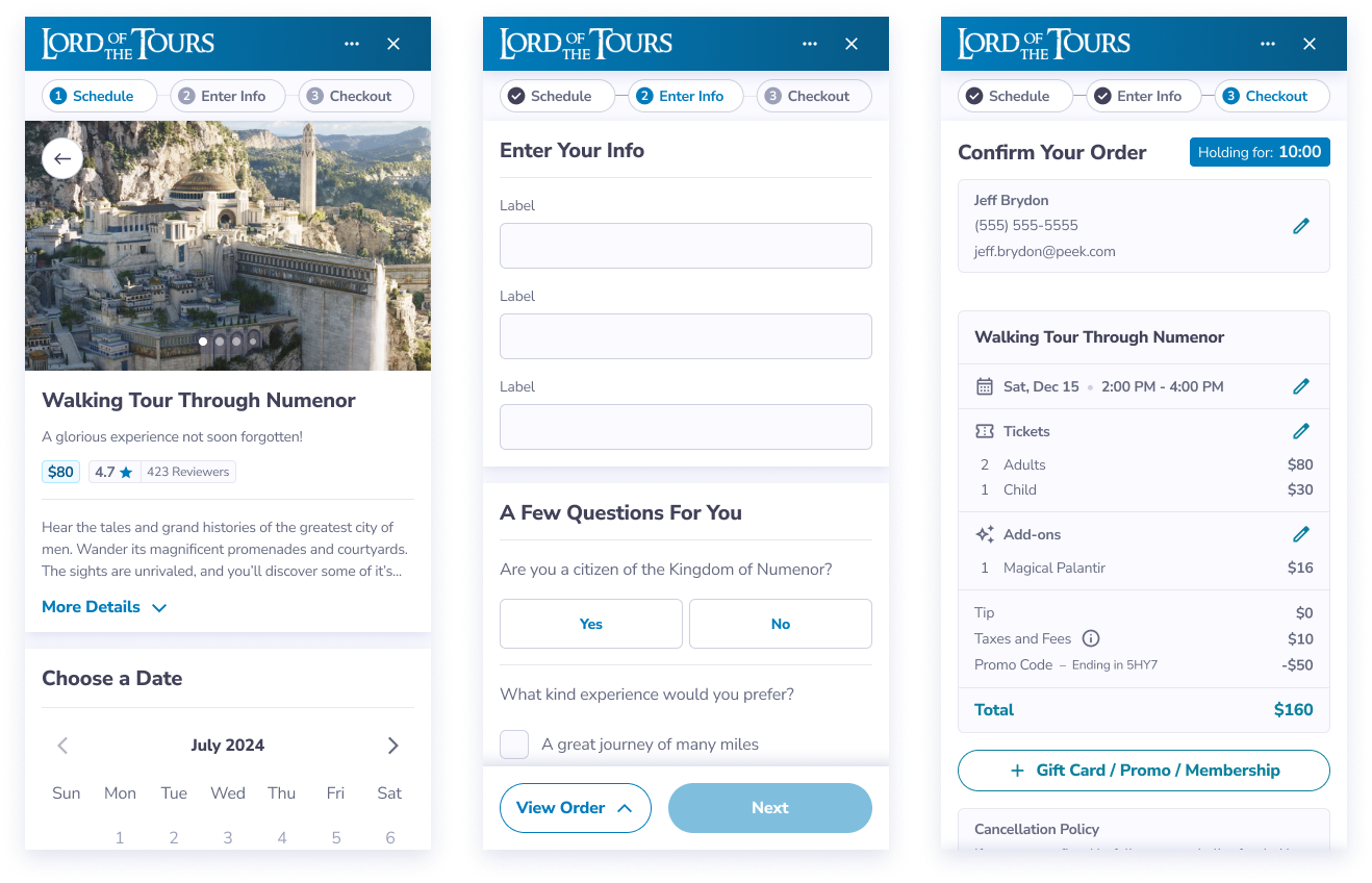
Wireframes
I used Wireframes to explore improvements in information architecture, then gain feedback from Design, Product, and Engineering. Improvements such as:
Putting tour photos and details first on mobile (rather than starting with the date picker).
Using a collapsed details section to keep the date picker visible above the fold (it is a critical next step).
Moving "select tickets" to the first page, below the date and time pickers.
I wireframed dozens of other flows, but I'll spare you the details.
I designed mobile-first, exploring multiple solutions. For example, which design for tour cards is optimal?
A

B
C
Option A is slightly cleaner, and most users would tap the card for more info, but we had to consider less-tech-savvy users; a clear affordance seemed wise.
Option B has a very clear affordance. However,
this study explains how Google raised engagement to a hotel booking flow by changing "Book a Room" to "Check Availability" – "Book a Room" implied a higher commitment, causing hesitation in some users. So, I decided against the "Book" CTA, opting for Option C.
Improving Page Layout
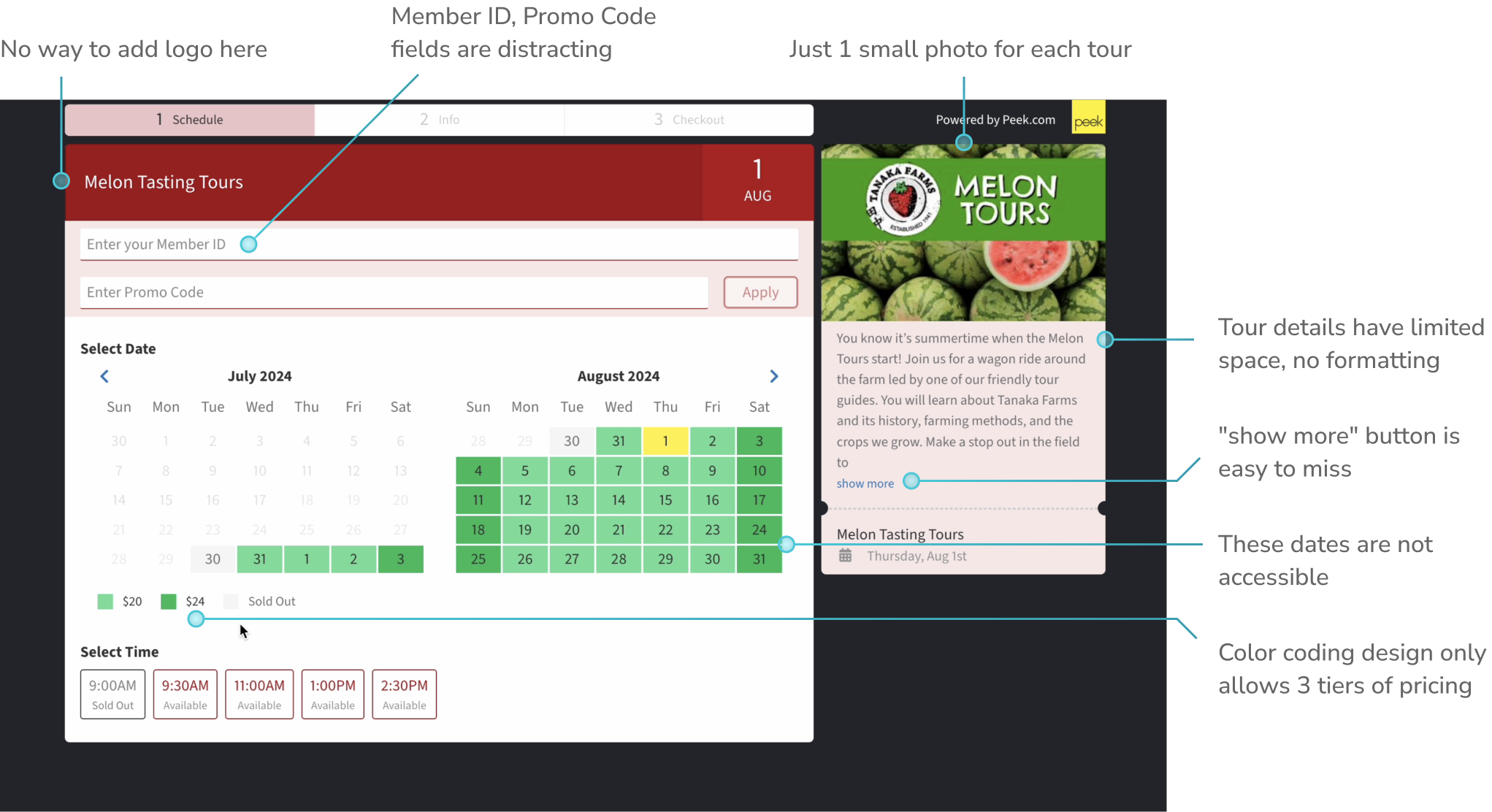
Great visuals can boost conversion. The existing booking flow (below) missed this opportunity, as it only displayed 1 small photo:
I explored various desktop layouts with a stronger emphasis on visuals and tour information, hoping to increase customer excitement about the tour:
Tour Details A:
Tour Details B:
Tour Details C:
Tour Details D:
I also moved those distracting "Member ID" and "Promo Code" fields to the checkout page.
Interactive Prototyping
Interactive prototyping was critical for making one of our bigger design decisions: should the flow happen mainly in a single page, or spread across multiple steps?
I prototyped these competing options for our Rental Booking Flow, a more-complex variant of the booking flow:
The multi-step flow also gave us an opportunity to use a progress bar or stepper. This could boost conversion using the Zeigarnik Effect. But which design is best?
Stepper A:
Stepper B:
Progress Bar:
A progress bar is simpler, but still a great way to take advantage of the Goal Gradient Effect. It allows us to add more steps, such as an "Upgrades" step:
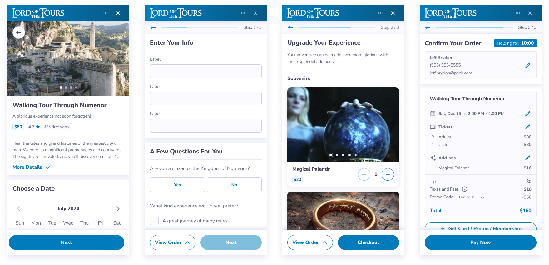
The Progress Bar (the 3rd option above) was the simplest way to leverage the Zeigarnik Effect. It also allowed us add more steps without having to add more elements at the top of the page.
I continuously shared these prototypes with the Design Team, Product Team, Engineering Team, and our CTO, considering them through the lenses of user needs, business goals, and technical constraints. For some decisions, I also gathered "end-user" input:
A/B Testing of Social Proof
Using our existing live booking flow (not my designs), we had enough user volume to run statistically significant A/B tests. Since social proof is a proven conversion driver and Peek already collected reviews, my PM and I tested adding reviews directly in the live flow.
A (Contol)
B
C
My Product Team had previously tested a longer reviews section, but it lowered conversion – reviews can be distracting, leading users down a review rabbit-hole.
In designs B and C above, I tried adding small ratings and reviews sections that wouldn't be overly distracting.
The results – options B and C still lowered conversion! Perhaps users didn't trust either of these small ratings and reviews sections. Perhaps a different design would work better. Unfortunately, we had run out of time for A/B testing, and were forced to cut social proof until a future iteration.
User Testing with Lyssna
Lyssna is a user testing tool that helps you test Figma prototypes with a large pool of paid participants.
I choose to test a few date and time picker designs because they were surprisingly complex – they needed to (occasionally) show not just dates and times, but also prices, announcements, and the number of tickets left. I tested 3 design solutions:
I recruited 90 participants from Lyssna's tester pool, having them attempt to "book one of the cheaper dates / times for 3 adults" in one of the Figma prototypes.
The results: Options A and C had a higher task completion rate and fewer miss-clicks. In these solutions, users immediately understood the pricing shown, whereas not all participants paid attention to the pricing key in Option B.
Since Option A and C performed equally well, I collected input from the Design Team and Engineering Team to make the decision. The consensus was Option C because it was a more recognizable design pattern and would be easier to build.
Interviews with Tour Operators
I teamed up with our User Researcher to interview 8 tour operators. We recruited a variety of verticals and business sizes, including a hiking tour, a farm tour, a bike rental operator, and several immersive museums.
We discussed their most-needed features and walked though my prototypes. Several operators emphasized the value that they saw in Daily Announcements, as well as a Browse by Date option, which you'll see in my final designs.
Components
We had no design system for our customer-facing UI. As I designed the booking flow, I created new components along the way (this ensured that the design system was optimized for real flows and real use-cases).
I strived to make the visual design simple, accessible, modern. I took inspiration from Airbnb – a clean UI that used color sparingly, yet meaningfully.
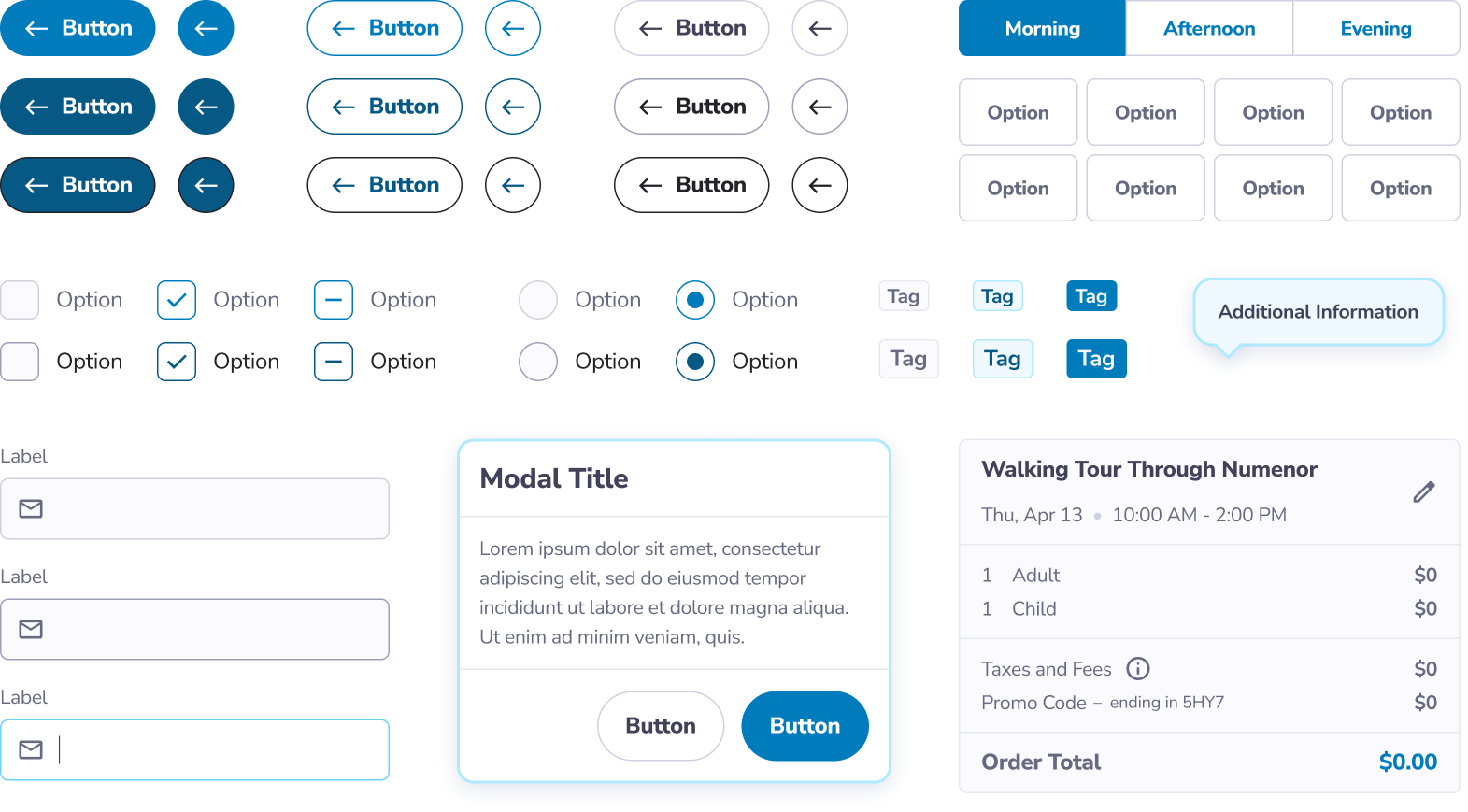
Styles
I defined typography styles, spacing, breakpoints, shadows, and a grid system. Rather than a single color palette, I defined 25 color palettes, expanding our existing color themes:
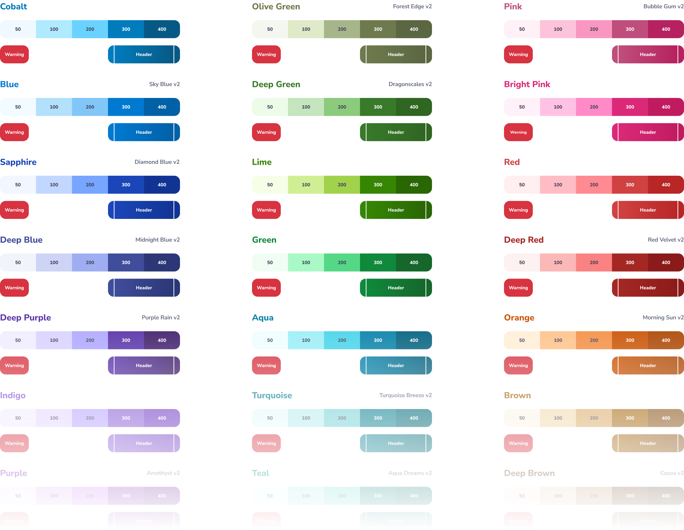
I designed each color palette to have equivalent shades so that, regardless of the palette applied, the visual hierarchy is consistent and components are accessible.
Many tour operators also want custom color themes, so that they can match their brand's exact colors. To allow this without creating accessibility concerns, I planned to add accessibility guidelines as well. But given our time constraints, we decided to save custom color themes (as well as font selection) for future releases.
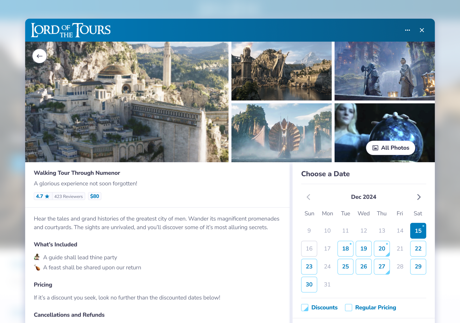
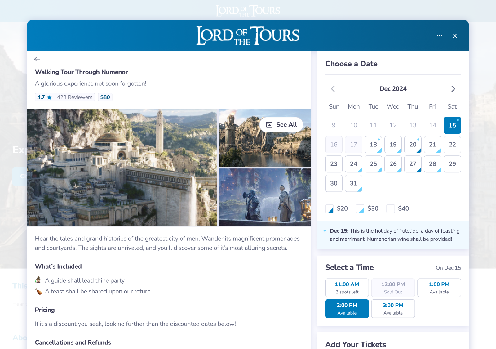
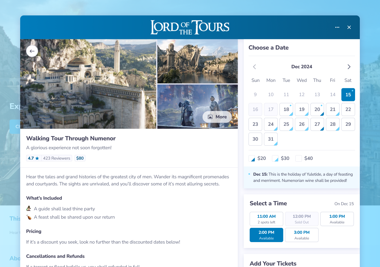
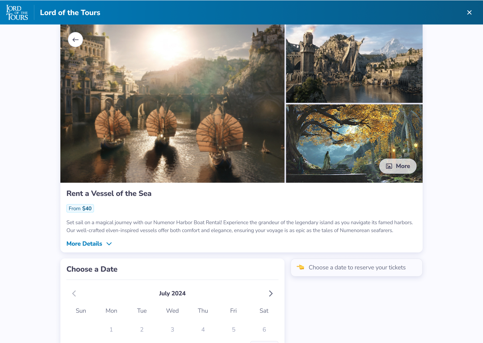
Activity Booking Flow
On the Tour Details page, prominent images and scannable tour details help generate excitement for the tour. Larger tour operators also loved the new daily announcement feature, which allowed them to promote special events.
(For a clearer image below, increase YouTube's video quality under settings)
Rentals Booking Flow
I designed the flow to be modular, so "Add Rentals" and "Choose a Duration" sections could be added:
The layout above also converts easily to mobile, since the right-hand column is already mobile-width.
I'm also proud of the level of pricing transparency in this flow. Peek's existing booking flow added taxes and fees at checkout – springing extra costs at the end is a common dark pattern, as it can increase revenue.
The pricing transparency in my redesign is not only a better experience – it's now legally required in CA and NY (as of late 2024). This made it much easier to push for better UX over revenue-boosting dark patterns.
Browse by Date
Tour operators usually have multiple tours to choose from. Some customer want to join a specific tour, while other customers want a specific date.
"Browse by Date" made it easier for customers to see all the tours available on their specific date, as well as what times were still available:
Seat Picker
The modular design made it easy to additional functionality, like this seat picker. The seat picker was yet another feature supported our goal to unlock new verticals, such as concerts and bus tours.
Social Proof
While the A/B tests for Ratings and Reviews had been unsuccessful so far, I still believed that social proof could boost conversion, given the right design. I designed a "Highlighted Reviews" section that we could use for future A/B testing:
Results
🎉 Increased conversion!! A/B testing showed a 4.7% increase in conversion (compared to the existing booking flow), leading to a solid increase in revenue!
🎯 Attracted new verticals – the new Daily Announcements feature helped our sales team gain traction in verticals that host special events (such as immersive museums). The Seat Picker allowed our sales team to go after concert venues and bus tours.
✨ Enhanced operators' brands – tour operators were thrilled with the visual design improvements, the ability to show off multiple photos, and improved control over the flow's branding.