

Company
Atlassian builds tools for collaboration and project management.
Prompt
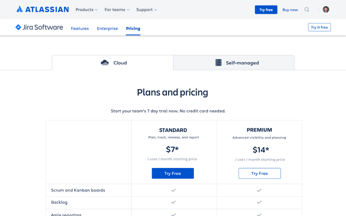
Redesign the Jira Pricing page in 6 weeks, before the release of Standard and Premium plans.
Goal
Help visitors understand the new Pricing Plans and Atlassian's complex pricing structure. Increase the Free Trial clickthrough rate, if possible.
My Role
I contracted with Atlassian's Buyer Experience Team for 6 months, working mainly with a PM. For this project, I led research, design, testing, and communication with 7 stakeholder teams.
Pricing pages must be crystal clear to keep potential buyers moving forward. Atlassian had no sales team, making this even more critical.
The Buyer Experience had tried numerous designs to explain pricing. The most recent were:
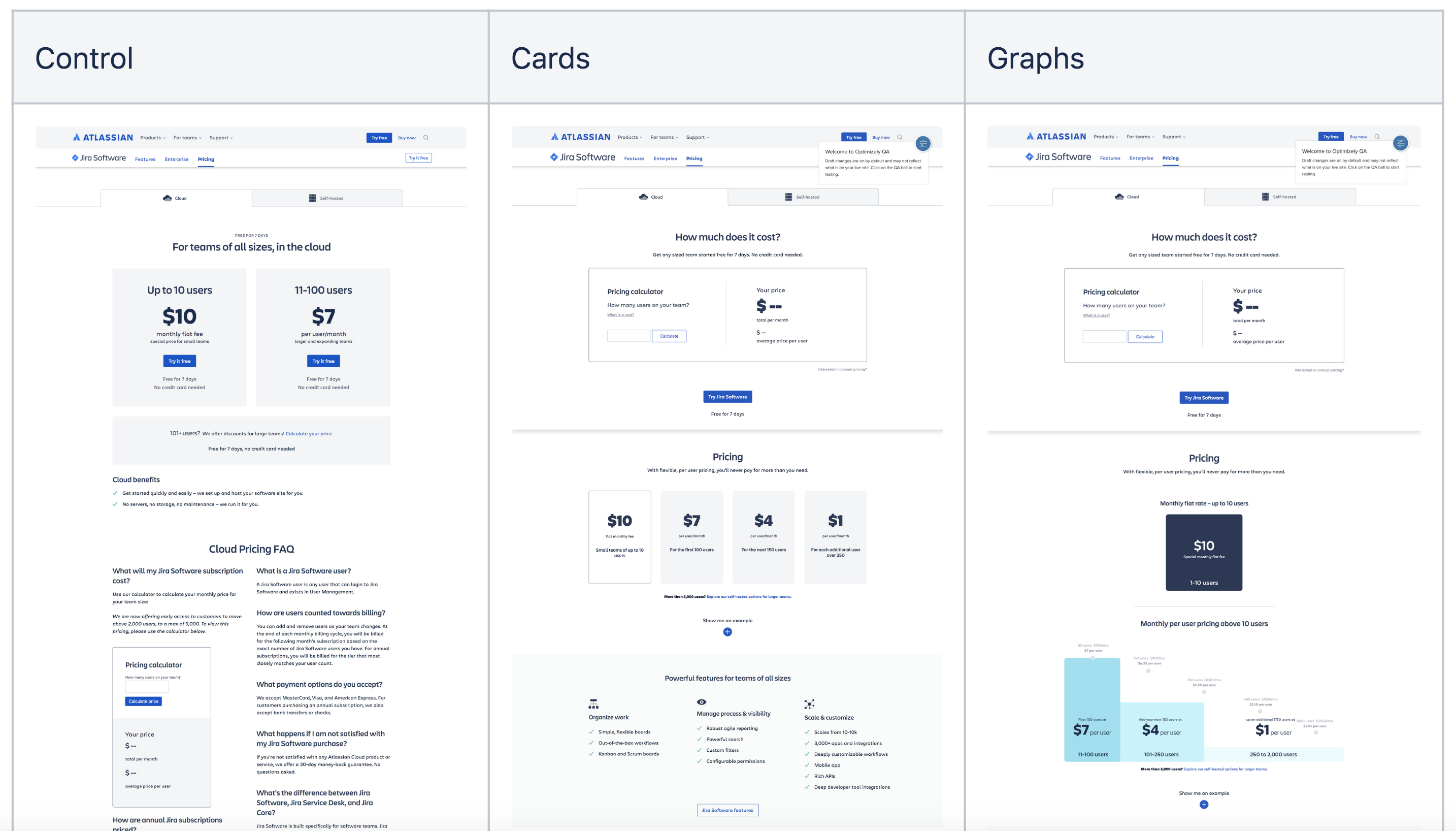
After extensive A/B testing, the Cards design had the highest click-through rate, so it had been deemed a winner.
The problem: recent usability testing revealed that half of all visitors misunderstood the pricing structure, after seeing the Cards design, shown below. Based on this page, how much do you think Jira would cost for a team of 110 users each month?
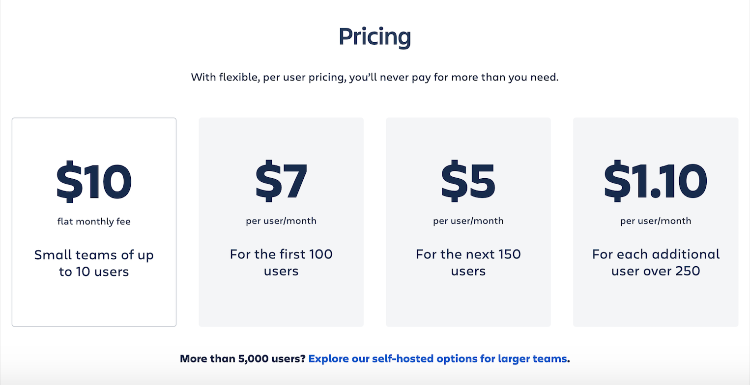
Many users assumed this represented simple user tiers – the pricing structure used by most SAAS products. Wrong! This page attempts to explain "progressive pricing": (first 100 users x $7/ user) + (next 10 users x $5/ user) = $750/ mo.
The challenge was: how to explain progressive pricing as simply as possible to keep users moving down the funnel?
User Interviews
The Buyer Experience Team at Atlassian used A/B testing and usability testing extensively, they hadn't been doing discovery interviews and weren't deeply acquainted with buyers' goals and needs. I convinced my PM that we needed to interview users.
I led a two-week research sprint. With support from my PM, I Interviewing 6 people about their purchasing processes. I discovered valuable insights, such as: the first thing a Procurement person needs is a list of features (which our page didn't have!). I created "mini personas" to share my top takeaways:
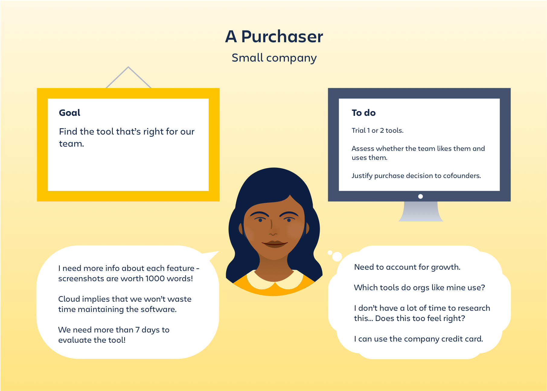
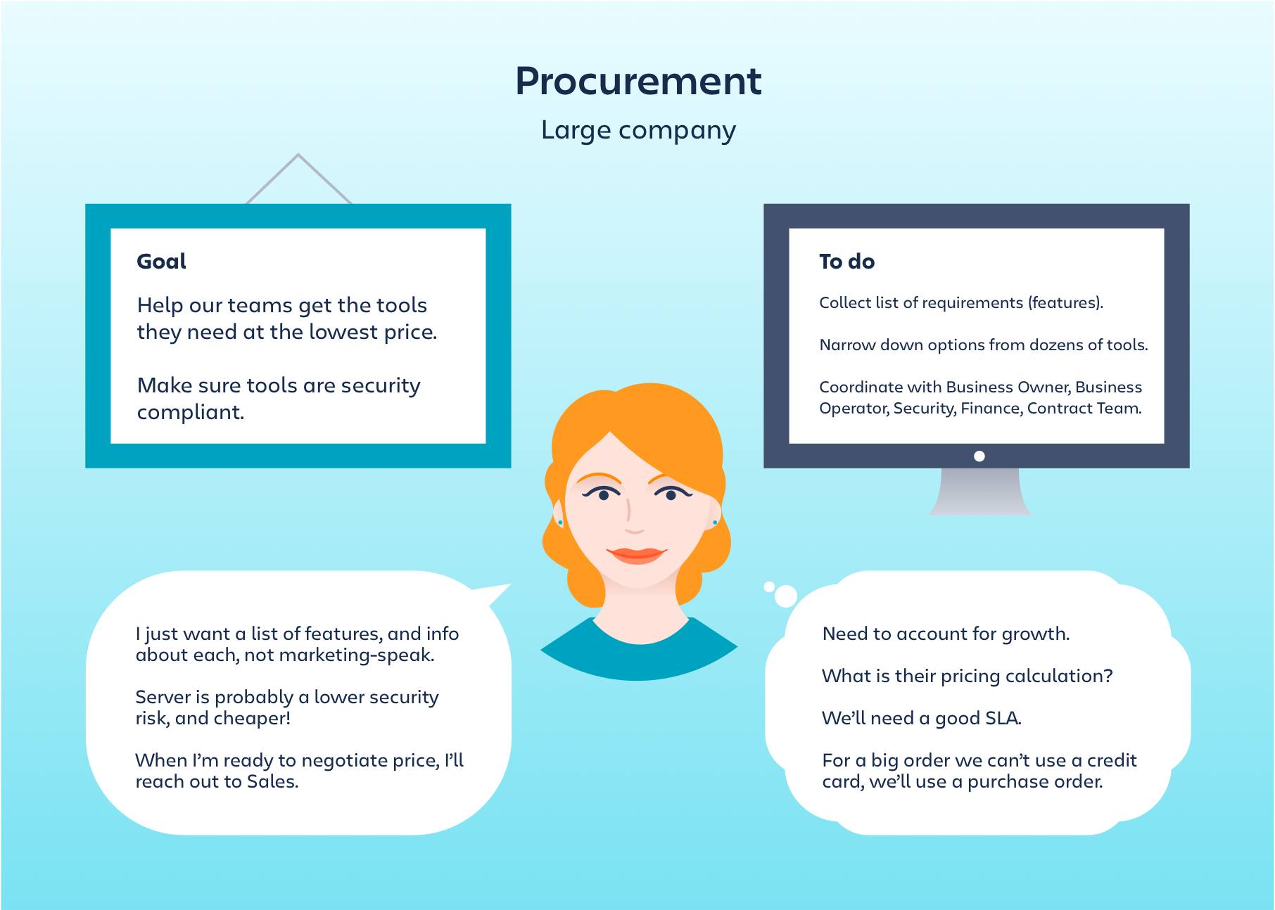
This research not only uncovered valuable insights, but convinced the Buyer Experience Team to do more open-ended discovery interviews going forward.
SAAS companies tend use very similar pricing page layouts, and buyers usually compare many tools, so they come to expect particular design patterns.
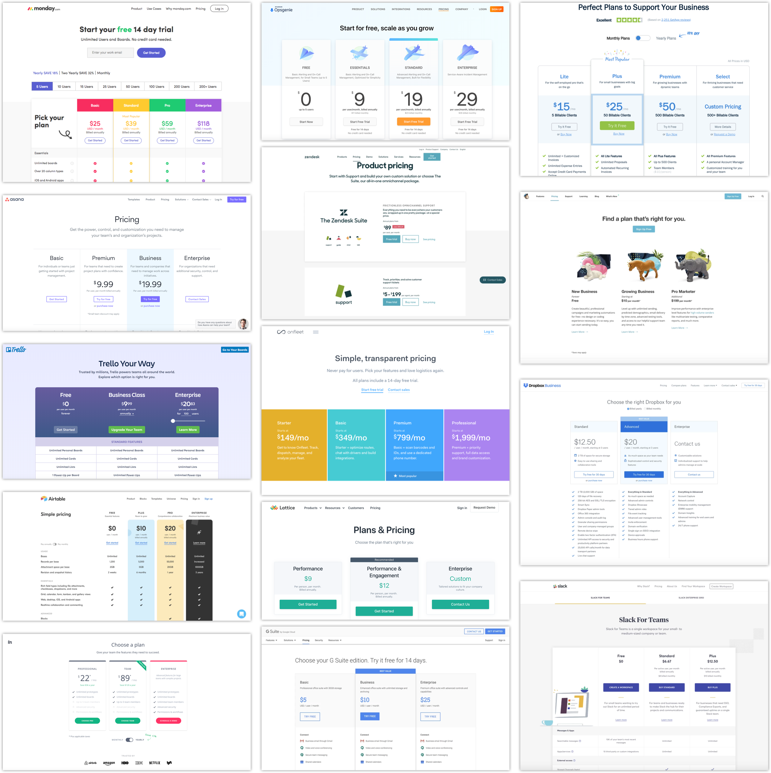
To leverage the brilliant design minds at Atlassian, I started the creative process with a design studio exercise. I encourage participants to sketch poorly (like me) and to think outside the box. In one hour we generated some great ideas.
Atlassian had an extensive design system, allowing me to prototype quickly.
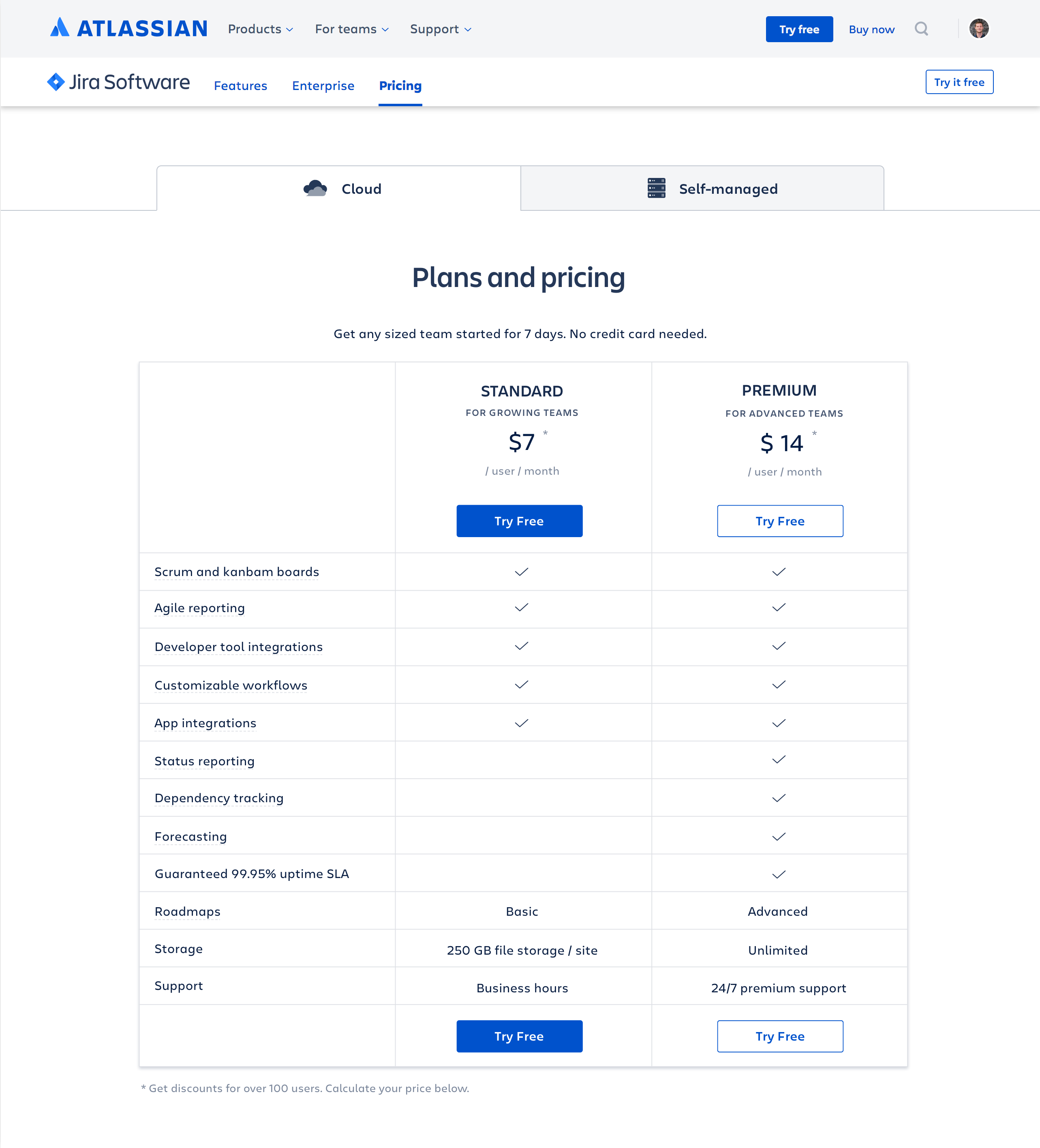
Classic Pricing Columns
As per Jakob's Law (users prefer recognizable design) the Standard and Premium plans would be front and center:
Design Options
From our user research, I knew users wanted more than just names of features – what do the features actually do? I evaluated several patterns that kept visitors moving towards the Free Trial (rather than diverting to various feature pages). Pricing Pages often use tooltips, but I had learned that users wanted screenshots.
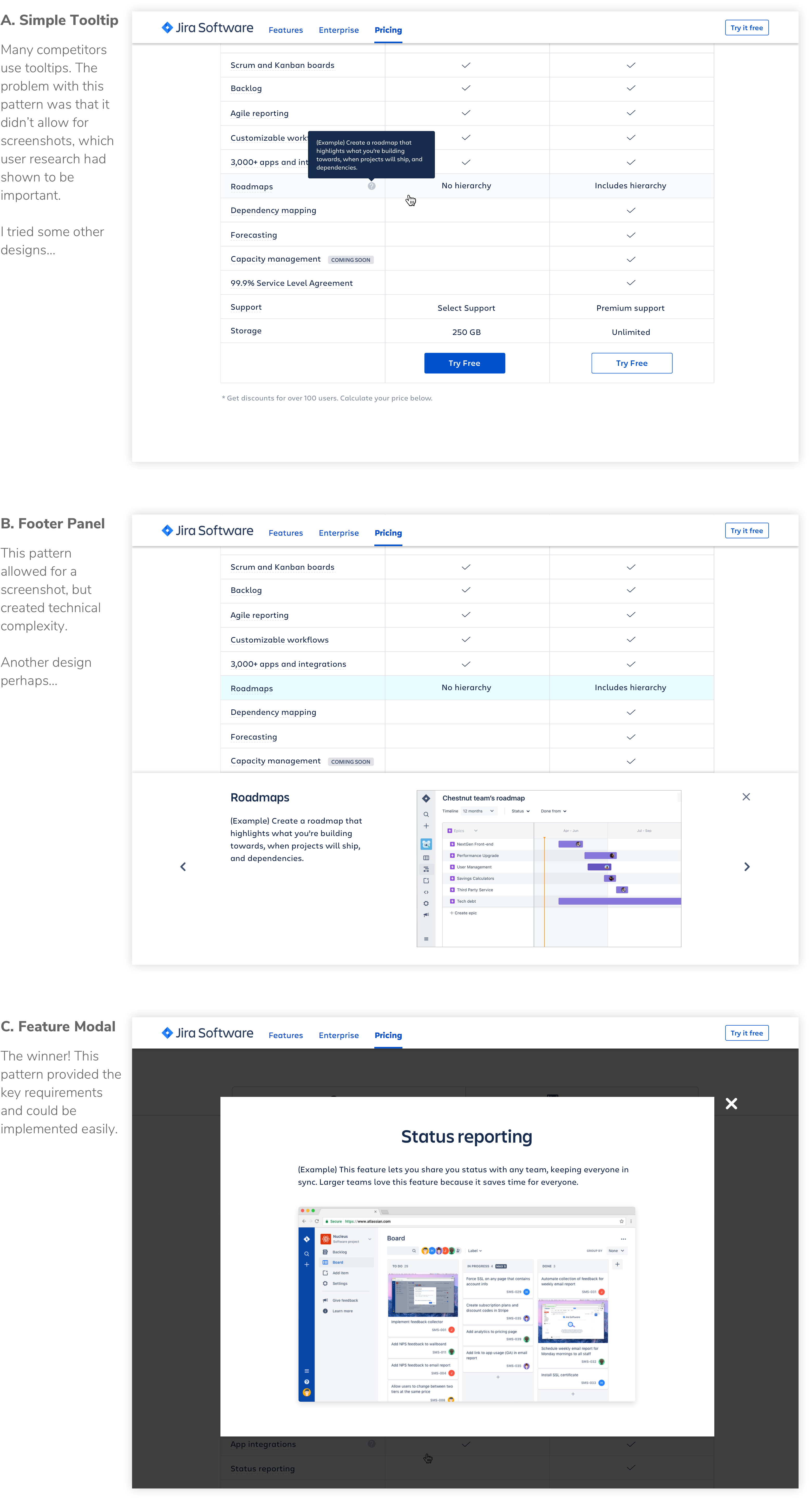
I communicated my designs to stakeholders and incorporated feedback from the following teams: Buyer Experience, Visual Design, Content Design, Marketing, Branding, Pricing, Localization, Jira Product, and my scrum team.
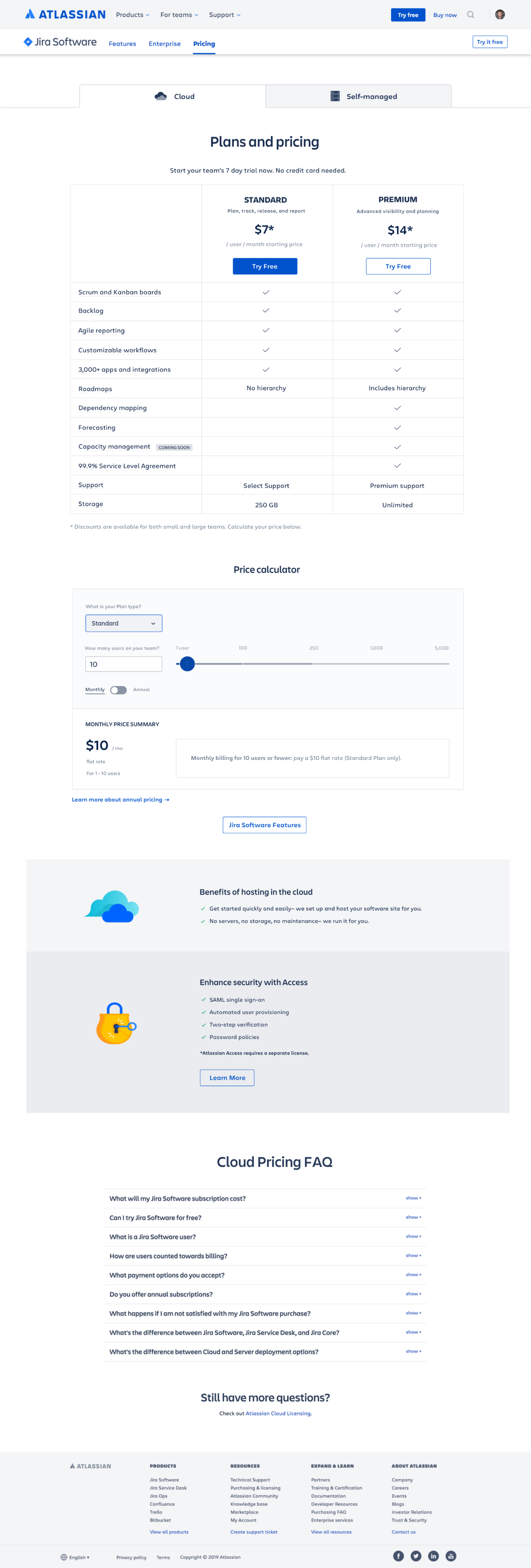
After 6 weeks of research, design, feedback, and iteration, I found an ideal solution. It explaining complex pricing structure while still moving buyers down the funnel.
Aha! 💡
Previous pricing pages had attempted to explain progressive pricing to all visitors. However, progressive pricing only applied to a small minority of page visitors –those with teams of 100 users or more.
I used the pricing calculator to reveal progressive pricing to the right users at the right time. When the slider is dragged above 100 users, the "show breakdown" button appears, which shows the progressive pricing equation in an intuitive way.
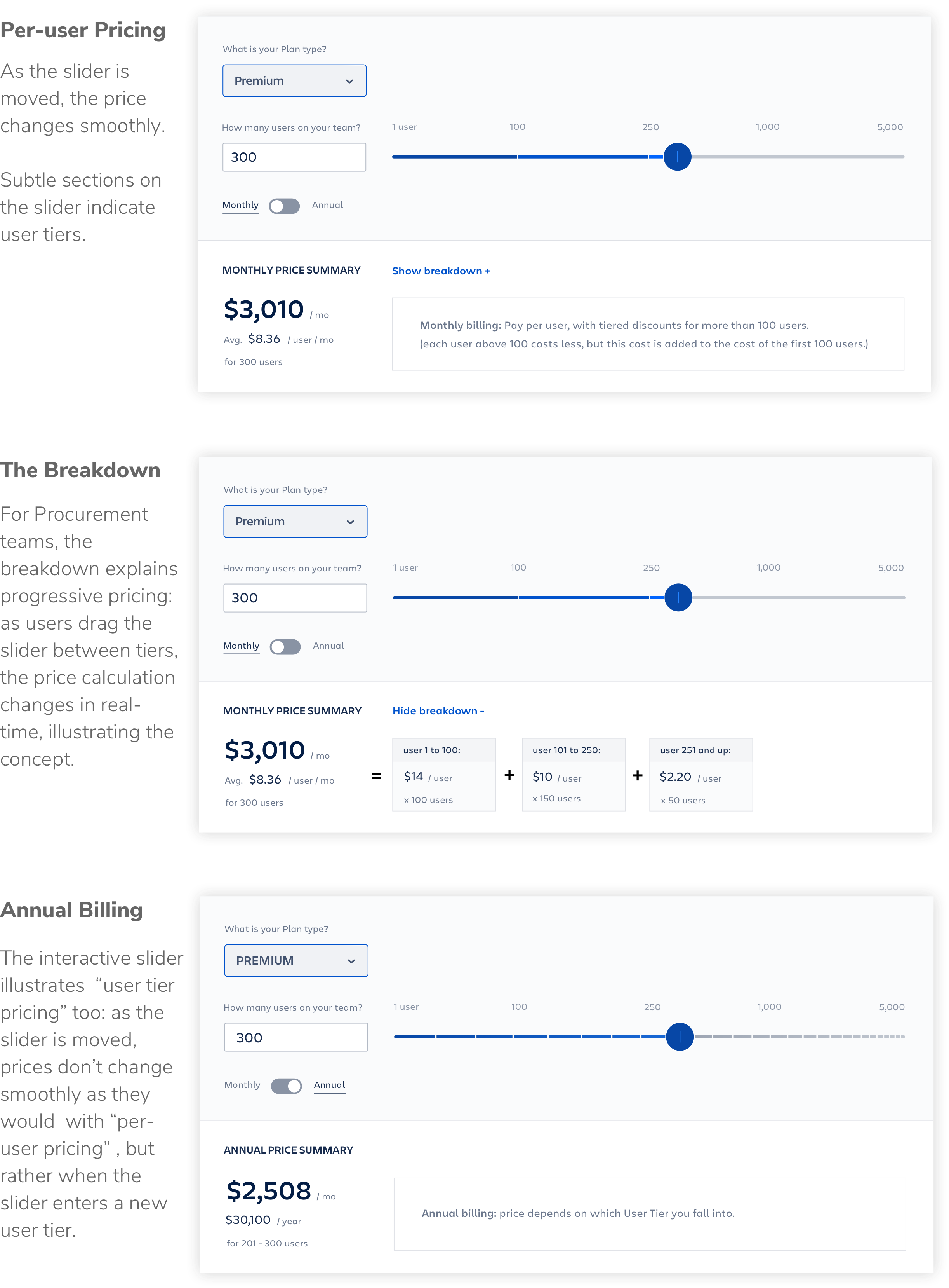
Watch the 20 second video to see the interactive slider in action:
When I usability tested the new page with 3 users, all 3 understood what the new pricing calculator was trying to show. The number of Trail signups didn't change significantly.
The Buyer Experience Team was thrilled I had found a design that could explain the new Pricing Plans, their complex pricing structure, and still keep users moving towards the Free Trial.
Learnings
I learn a lot about Pricing Page design, including:
☞ Limit choices to avoid "analysis paralysis" and "decision fatigue".
☞ Consider plan ordering: users spend more time reading about plans listed first
☞ The most common path is straight from the home page to the pricing page.
Kudos
Kind words from Janice, my PM and main partner on this project:
"I had the pleasure of working with Jeff on a high-profile project at Atlassian. Jeff jumped right in, researching competitors, organizing his findings, iterated on designs and tested it with users. We had a difficult design problem to solve and he delivered an elegant and usable solution, and did it with incredible passion and empathy for our users."
- Janice Tam, PM at Atlassian