Eagle Pay

Company

First Republic Bank – a traditional bank for the wealthy.

Prompt

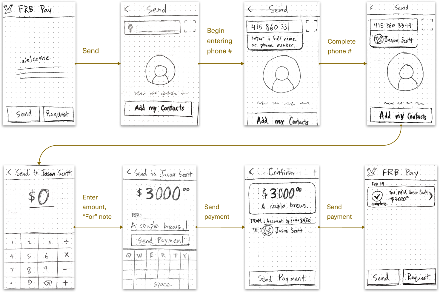
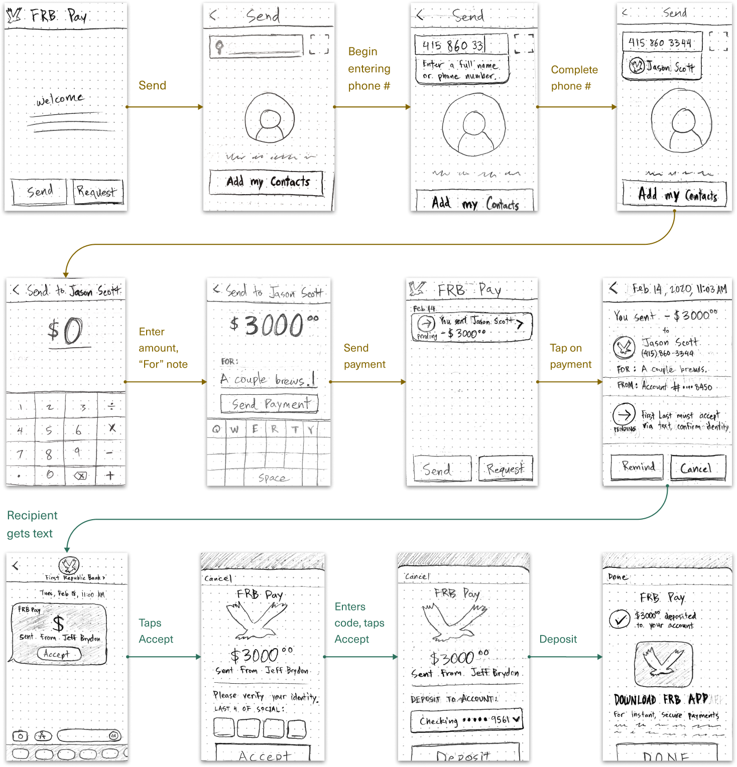
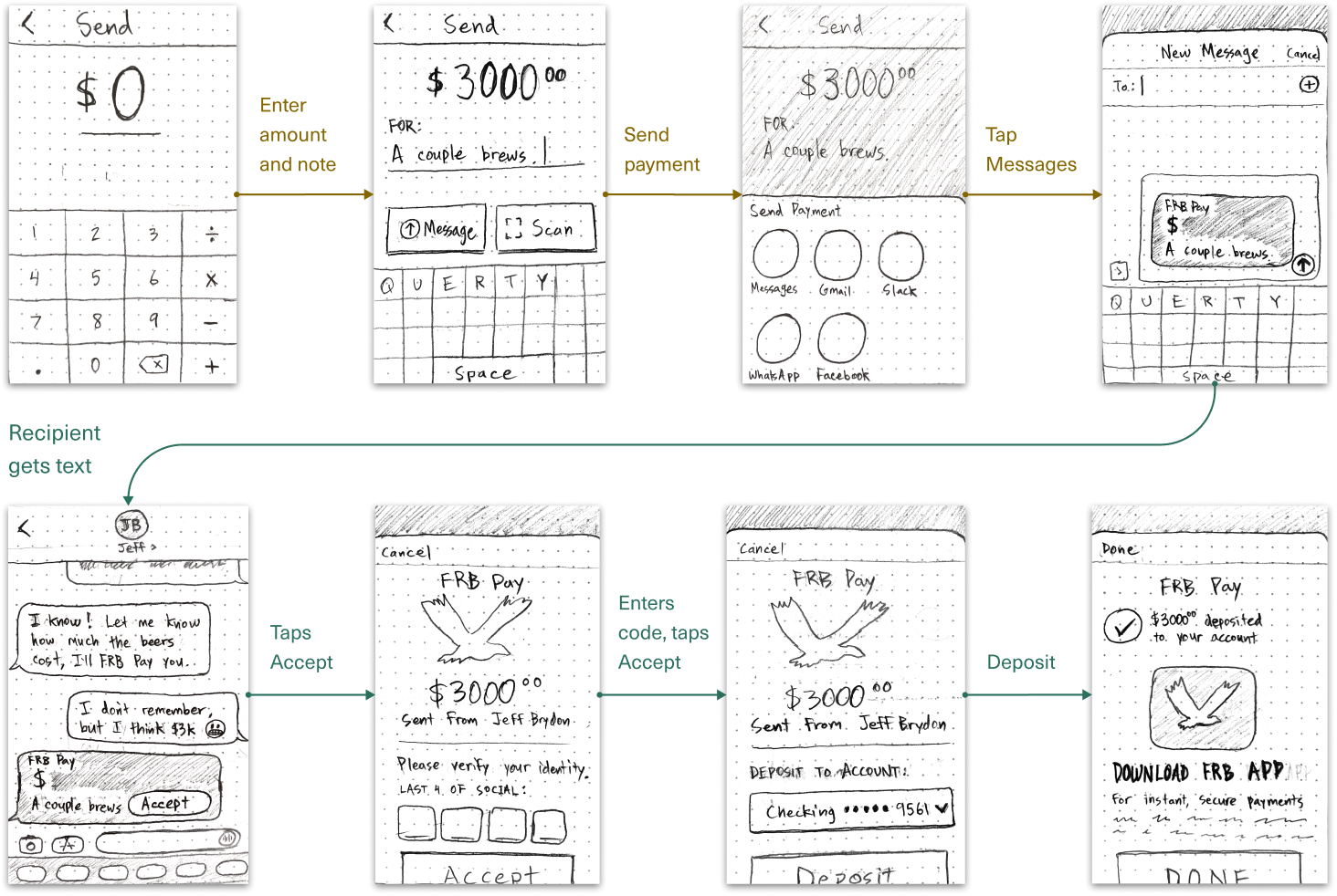
Design a peer-to-peer payment feature for the bank's existing mobile app. Design deadline: 4 weeks.

Goal

Expand the mobile app's value to increase the number of monthly active users.

My Role

I led this design process with support from my team at Y Media Labs.

The Problem

Apps like Venmo and PayPal have made it easy to send money to friends. However, First Republic's wealthy clients were being stymied by these apps' low daily transfer limits (only $750 per day! Bah! 🧐). While they could use wire transfers for larger sums, the process took days. FRB clients needed a payment app for the wealthy.

Gathering Insights

Personas

We were given personas, giving us a good general sense of the First Republic Bank client. These were kept confidential.

I recommended interviewing users more specifically about their payment needs, but FRB didn't want us pestering their wealthy clients. Luckily, Customer Support had insights about their clients' payment needs:

☞ To send large payments, often to family and business contacts.

☞ To set up recurring allowances, like monthly college allowances.

☞ To switch the account being debited (some users had dozens of accounts).

☞ To keep some recipients' names anonymous 🤔.

Competitive Research

I looked at popular payment apps to find design patterns users would recognize.

Innovative Payment Apps

Beyond the obvious payment apps, I searched for more innovative design patterns and payment strategies. Some examples included:

  • ☞ NuBank: uses iOS and Android share sheets to find intended contacts and notify them.

    ☞ Apple Pay: proximity-based payments from phones to card readers.

    ☞ Apple Pay: a Pay button built into Messages -->

Client Workshop

With the support from my team's design director, I ran an in-person workshop with First Republic stakeholders. Sketching sparked great discussions, such as:

☞ When sending $ to a new contact, how does the sender find the correct recipient?

☞ Should $ transfer instantly (like Venmo), or should recipients have to "Accept" payments (like PayPal)?

☞ What are the implications and risks of allowing large instant transfers?

Send Flow 1

In this flow, users can send money instantly, and recipients are notified that they've received a payment.

In this flow, recipients would be notified and then must Accept the payment. This step was potentially important for large payments – imagine you just sent $10,000 to your family member... you'd want to know they received it. One potential solution: a "Pending" status followed by an "Accepted" status.

In this flow, the sender could use the iOS share sheet to send the payment via the messaging app of their choice. Since users have some contacts saved in their phone, some in Slack, some in WhatsApp, and so forth, using the share sheet would make it easier to find the intended recipient.

Constraints

The workshop also gave as a better understanding of technical and business constraints. We ruled out proximity-based payments and a Messages integration, due to technical constraints. The biggest constraint was that users could only send money to other First Republic Bank clients, which meant the app would not be useful for paying friends (who might not be FRB clients). Our focus became payments to family members and business contacts, who often signed up in groups.

Interaction Design

Enhancing the Design System

Y Media Labs already had a design system in place. Using the existing styles, the Send Money flow would have looked like this -->

Accessibility

One problem with this: green color was the only affordance to show that certain fields were editable ("Caroline McKenzie"). This is not an accessible approach for the colorblind.

Color

I dialed back the use of color to make the app even more minimal and make colors more noticeable when used.

Affordances

Some of the interaction design I worked through: we needed to distinguish editable fields from disabled fields from plain text in an accessible way. Here are two designs I tried ("edit" text vs. edit icons).

Interaction Design

I explored multiple approaches here: sending money by entering info in a single form, vs. a "one step at a time" approach.

The "one step at a time" approach keeps users focused on only the task necessary at that moment – it feels simpler. However, it provides less visibility into what comes next, creating slightly more uncertainty.

How to Find the Right Recipient?

One of the main tasks in Sending money is finding the correct recipient. Other payment apps use @usernames to help users find their intended recipient. The problem with that is: usernames are hard to remember.

Since this payment app is designed to pay family and business contacts, I chose not to use @usernames. Instead, I used a "Sync Contacts" step for finding intended recipients, since users would already have family and business contacts saved in their phone.

For new contacts, users could still use a QR code to find their intended recipient.

Should the Recipient have to "Accept"?

A big question was whether the recipient should have to "Accept" payments. Some payments apps do this, other don't. The downside is that it creates friction. But for large payments, the Sender might want to know the Recipient had received the payment.

The clincher: this Accept step can also be used as a huge growth lever: rather than money appearing in their bank account, Recipients would be prompted to download the app to receive the payment!

Send Flow (using the Share Sheet)

The option created a higher fidelity prototype for the "send via share sheet" option we had been exploring.

However, when we dove into the details of this design solution with the client, it become clear that this option would take a lot more effort to build – we decided against it.

Final Design

My goal was to create a simple, fast payment flow, with a few advanced options designed specifically for First Republic's wealthy clientele. I designed a simple payment flow (inspired by Paypal) with clear affordances and clean and a minimalist visual design.

Unique Features

The features I included specifically for the bank's wealthy clientele:

☞ "Send with Face ID". When sending large transfers, users needed to trust our app's security. This feature reassured users that only they could send money.

☞ An option to quickly change which bank account to withdraw from. These wealthy user tend to have many separate accounts, and want this level of control.

☞ A "Recurring Payment" setting, useful for things like for allowances.

☞ A "Private" setting for discrete payments.

Results

Results should be measured with thoughtful metrics and qualitative testing. However, the client wanted my team designing a new feature, so my involvement with Eagle Pay culminated in a design handoff.

What Would I Do Next?

I would create an interactive prototype with multiple versions to test some some the unknowns with real users. These wealthy users might need some serious compensation for their time, but I believe getting the product right is worth it. I would want to answer things like:

☞ Did users find it valuable for to require recipients to "Accept" a payment?

☞ Do these users understand how QR codes work (to connect to new contacts)?

☞ Were any parts of this flow confusing, or any key features missing?

Kudos

"Jeff demonstrated a strong business acumen, meticulous attention to detail, and a good understanding of complex business processes. He strived for solutions and recommendations that were outside of the typical design thinking but focusing on a simple sophistication. I’d like to thank Jeff for his hard-work, dedication, professional ethics, and amazing results delivered in a short period of time. It was a great experience partnering with him."

- Anton Gogenko, Senior PM at First Republic Bank

Next Case Study

Jira Pricing Page

Interviews

Personas

Competitive Research

Concept Testing

Prototyping